A graphic representation of a pie chart and a bar graph. The pie chart is divided into four sections, each with a different color - red, orange, yellow, green, and blue. The red section is in the top left corner, the orange section is on the top right corner, and the blue section is at the bottom right corner. In the center of the image, there is a blue rectangle with a green arrow pointing upwards. The arrow is pointing downwards, indicating a decrease in the value of the pie chart. Below the arrow, there are three blue circles, representing the data points.
User jeremey uploaded the image
User jeremey uploaded the image
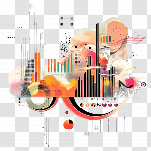
Infographic - Data Visualization Icon For Business Insights PNG
. The resolution of this PNG file is 2048 x 2048 pixels and it has a file size of 871.47 KB.Infographic - Data Visualization Icon For Business Insights PNG
You might also like these images below...