A 3D pie chart. It is a circular pie chart with a yellow base and an orange top. The pie chart is divided into three sections, each with a different color - yellow, orange, and black. The yellow section is slightly larger than the orange section, and the black section is smaller than the yellow section. The chart appears to be a representation of the percentage of people who have been diagnosed with cancer.
User missazii uploaded the image
User missazii uploaded the image
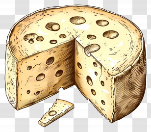
Cheese Wheel - Cartoon Cheese Wheel Illustration With Slice PNG
. The resolution of this PNG file is 2048 x 2048 pixels and it has a file size of 696.74 KB.Cheese Wheel - Cartoon Cheese Wheel Illustration With Slice PNG
You might also like these images below...