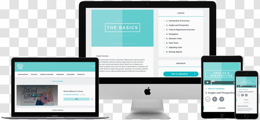
The image shows a variety of electronic devices, including a laptop, a desktop, a mobile phone, and a tablet, all displaying a website design for a company called "The Basics". The website is displayed on all three devices. The laptop is on the left side of the image, the desktop is in the center, and the mobile phone is to the right. The laptop screen displays the website's main content, which is a blue and white color scheme with the company's logo and contact information at the top. The tablet screen displays a list of topics related to the company, such as "Introduction & Overview", "Tools & Techniques Overview", and "Angles & Perspective". On the right side, there is a mobile device displaying the same website design. The website has a blue header with white text and a white background. The overall design of the website is modern and minimalistic, with clean lines and a clean layout.
User orenii uploaded the image
User orenii uploaded the image
Responsive Web Design Development Application PNG
. The resolution of this PNG file is 1853 x 856 pixels and it has a file size of 3.10 MB.You might also like these images below...


