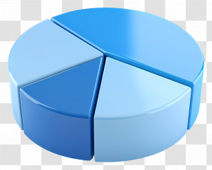
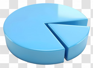
A 3D rendering of a blue pie chart. The chart is circular in shape and has a smooth surface. It is divided into four sections, each with a different color - blue, white, and light blue. The largest section is slightly larger than the other three sections, and the smallest section is smaller than the largest. The pie chart appears to be showing the percentage of people who have been diagnosed with cancer.
User mscouraz uploaded the image
User mscouraz uploaded the image
Pie Chart - 3D Blue Pie Chart Illustration PNG
. The resolution of this PNG file is 3828 x 2836 pixels and it has a file size of 3.02 MB.You might also like these images below...